
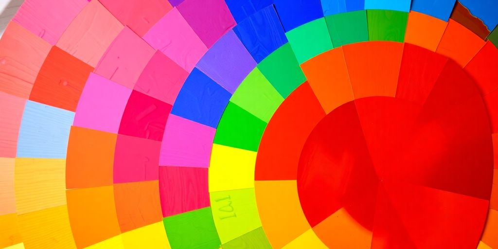
Ever wondered why some color combinations just work? It’s all thanks to the color wheel. This magical circle of hues helps artists, designers, and even fashionistas pick colors that look great together. From the basics like primary colors to complex schemes in digital art, the color wheel is your go-to guide. Whether you’re painting a masterpiece, redecorating your home, or just picking an outfit, understanding the color wheel can make all the difference. So, let’s dive into this colorful world and see what makes it tick.
Key Takeaways
- The color wheel is a tool that shows how colors relate to each other.
- Primary colors are red, blue, and yellow; they form the basis for all other colors.
- Secondary colors are made by mixing primary colors, and tertiary colors come from mixing primary and secondary colors.
- Complementary colors are opposite each other on the wheel and create contrast, while analogous colors are next to each other and create harmony.
- The color wheel is used in various fields like art, design, beauty, and fashion to create appealing combinations.
Understanding the Basics of the Color Wheel

Primary Colors and Their Significance
Let’s talk about primary colors. They’re the real MVPs of the color world. Red, blue, and yellow are the big three. These are the colors that can’t be made by mixing other colors. Think of them as the starting point for all other colors. They’re like the main ingredients in a recipe; without them, you can’t whip up anything else. When you mix these primary colors, you get secondary colors, but more on that in a minute.
Secondary and Tertiary Colors Explained
Alright, so once you’ve got your primary colors, you can mix them to get secondary colors. Here’s how it works: mix red and blue, and you get purple. Blue and yellow give you green, and red and yellow make orange. It’s like magic, but with paint! Now, if you take a primary color and mix it with a secondary color, you get a tertiary color. For example, mix blue with green, and you get blue-green. Mix red with orange, and you get red-orange. It’s all about finding that perfect blend.
Complementary and Analogous Colors
Now, let’s dive into complementary and analogous colors. Complementary colors are opposite each other on the color wheel. They create a high contrast and vibrant look when used together, like blue and orange or red and green. They’re perfect for making something stand out. On the flip side, analogous colors are neighbors on the color wheel. They usually match well and create serene and comfortable designs. Think of a sunset with reds, oranges, and yellows blending together. It’s all about balance and harmony.
The color wheel is more than just a circle of colors; it’s a tool that helps us understand the relationships between colors, making it easier to create beautiful and cohesive designs.
The Role of the Color Wheel in Art and Design
Using the Color Wheel in Painting
The color wheel is like a painter’s secret weapon, guiding them to mix colors that sing together on the canvas. It’s all about understanding how colors interact. When you know that red and green are complementary, you can use them to create vibrant contrasts in your artwork. Painters often use the color wheel to decide which hues will dominate and which will support, crafting a balanced and engaging piece.
Color Wheel Applications in Interior Design
Interior designers rely on the color wheel to create spaces that feel just right. Whether it’s a cozy bedroom or a lively living room, the right color scheme can make all the difference. Designers use the wheel to find colors that either complement or contrast with the main color of a room. For example, if you’re working with a blue sofa, a touch of orange in the decor can make it pop, while greens and purples create a serene vibe.
Digital Art and the Color Wheel
In the world of digital art, the color wheel is just as crucial. Artists working on screens use RGB color models, which are rooted in the same principles as the traditional color wheel. This helps them choose colors that look great on digital devices. Whether creating a new app design or an animated film, understanding color relationships ensures that the visual experience is cohesive and appealing.
Color Wheel in Beauty and Fashion
Makeup Tips Using the Color Wheel
The color wheel is a game-changer when it comes to makeup. Understanding how colors interact can elevate your makeup game. Here’s how you can use it:
- Complementary Colors: These are opposite each other on the wheel. Using them can make features pop. For example, green eyeshadow can highlight red undertones in your skin or hair.
- Analogous Colors: These sit next to each other on the wheel and offer a more natural look. Think of using blues and greens together for a subtle, cohesive appearance.
- Triadic Colors: These are evenly spaced around the wheel. They can create vibrant looks, like combining purple, green, and orange for a bold eye makeup.
Experimenting with color combinations can lead to exciting new looks. Don’t be afraid to try something unexpected; it might just become your signature style!
Hair Coloring Techniques with the Color Wheel
Choosing the right hair color can transform your look completely. The color wheel can help you decide:
- Contrast and Complement: Want to make a statement? Choose a color that contrasts with your natural hair color. This can create a dramatic effect that stands out.
- Undertones and Depth: Consider your skin’s undertones. Warm undertones pair well with warm hair colors like golden blonde, while cool undertones are complemented by ash browns or blues.
- Innovative Techniques: Techniques like balayage and ombre benefit from understanding the color wheel, allowing you to create depth and dimension in your hair.
Fashion Coordination with Color Theory
Fashion is all about expressing yourself, and the color wheel can guide your choices:
- Matching Makeup with Clothes: Use the color wheel to ensure your makeup complements your outfit. This creates a harmonious look that’s pleasing to the eye.
- Choosing Accessories: Extend the wheel’s application to accessories. A complementary color for your handbag or shoes can make your outfit pop.
- Seasonal Color Choices: Different seasons call for different colors. Pastels for spring, rich hues for fall—let the wheel guide your seasonal wardrobe changes.
Mastering the color wheel in beauty and fashion isn’t just about following trends; it’s about finding what works best for you. Color choices in various design fields, including fashion, play a crucial role in conveying messages, influencing emotions, and creating visual impact.
Exploring Advanced Color Theory Concepts
Hue, Saturation, and Lightness
Let’s break down these three fancy terms. Hue is basically the color itself—think red, blue, green. It’s what you see when you look at a rainbow. Then there’s saturation, which is all about how intense or vivid a color is. Imagine turning up the volume on your favorite song—that’s what saturation does to color. Finally, there’s lightness, which is how bright or dark a color appears. It’s like adding milk to coffee; the more you add, the lighter it gets.
The Psychology of Colors
Colors aren’t just for show; they mess with your head too. Red might get your heart racing, while blue can chill you out. It’s all about how different shades make us feel. Ever wonder why fast-food chains love red and yellow? They’re stimulating and can make you feel hungry. On the flip side, blue is often used in offices to boost productivity, thanks to its calming vibe.
Modern Color Models: RGB and CMYK
In today’s digital world, colors go beyond the traditional wheel. RGB and CMYK are two modern models you need to know. RGB stands for Red, Green, and Blue, and it’s used for digital screens. Think of it as mixing light to create colors. On the other hand, CMYK is for print and stands for Cyan, Magenta, Yellow, and Key (Black). It’s all about mixing inks, not light, to get the desired color on paper.
Understanding these concepts might seem like a lot, but once you get the hang of it, you can really start to play with colors in a way that makes sense for whatever you’re working on. Whether you’re painting a masterpiece or just picking a new color for your living room, these basics can guide you to make the right choice.
Practical Applications of the Color Wheel
Creating Harmonious Color Schemes
Using the color wheel to craft harmonious color schemes can completely change how a space feels. Picture your living room: you’re aiming for a soothing vibe, so you start with a calming blue. Now, using the color wheel, you can find colors that work well with your blue. For a harmonious look, you might go with green or purple, which are analogous to blue. Or, if you’re feeling bold, go for orange, which is directly opposite blue on the wheel and offers a vibrant contrast.
Troubleshooting Common Color Mistakes
Ever put together an outfit or a room and something just feels off? It could be a color mistake. Here are a few common ones and how to fix them:
- Overusing complementary colors: While they pop, too much can be overwhelming. Balance with neutral tones.
- Ignoring undertones: Colors have undertones that can clash if not matched carefully.
- Too many colors: Stick to a simple palette to avoid chaos.
Tools and Resources for Color Exploration
Getting the colors just right can be tricky, but there are tools to help. Apps like Adobe Color CC let you play around with color combinations before committing to them. For hands-on activities, explore color wheel activities that make learning fun. These tools not only help in visualizing but also in understanding the relationships between colors.
The Emotional and Psychological Impact of Colors

Colors are not just about aesthetics; they have a profound impact on our emotions and mood. Each color carries its own unique energy and can evoke specific emotional responses. For instance, blue is associated with stability, often evoking feelings of calmness and trust. It’s why blue is a popular choice for bedrooms and offices, where a serene atmosphere is desired.
Color Choices and Personal Expression
Choosing colors goes beyond just picking what looks good. It’s about expressing yourself and creating an environment that reflects your personality. Here are a few ways colors can be used for personal expression:
- Bold Reds: Use red to convey passion and energy. It’s a color that demands attention and can make a powerful statement.
- Calming Greens: Green is reminiscent of nature and can bring a sense of peace and renewal to your space.
- Joyful Yellows: Yellow is the color of optimism and happiness, perfect for spaces where you want to feel uplifted.
Cultural Significance of Colors
Colors can mean different things in different cultures. For example, while white is often associated with purity in Western cultures, it can symbolize mourning in Eastern cultures. Understanding these cultural nuances can help you make more informed choices when it comes to color selection.
Colors are a universal language that can transcend barriers and connect us on an emotional level. Whether you’re decorating your home or choosing an outfit, the colors you select can speak volumes about who you are and how you feel.
Real-World Examples and Case Studies
Interior Design Transformations
When you think about transforming a space, color plays a huge role. Imagine walking into a room painted in deep blues and greens, colors known for their calming effects. Colors aren’t just for aesthetics; they influence how we feel in a space. In one case study, a small apartment was transformed using complementary colors like orange and blue. The result? A vibrant yet balanced living area that felt both lively and cozy. Here’s a quick breakdown of how you might use complementary colors:
- Walls: Choose a dominant color for the walls, like a soft blue.
- Accent Pieces: Use complementary colors for furniture or art pieces, such as orange cushions or paintings.
- Lighting: Opt for warm lighting to enhance the overall mood.
Artistic Projects and Color Experiments
Art projects often push the boundaries of color use. Take the example of an artist who decided to create a series of paintings using only secondary colors. The challenge was to evoke emotion without the primary colors we’re so used to seeing. This project not only showcased the versatility of secondary colors but also highlighted how they can stand alone in creating depth and emotion. Here’s how you can experiment with colors:
- Select a color scheme: Stick to secondary colors like green, orange, and purple.
- Mix and match: Experiment with different shades and tones to see what emotions they evoke.
- Observe reactions: Notice how different people respond to your color choices.
Beauty Makeovers Using the Color Wheel
The psychological effects of color aren’t just for interiors or art—they’re pivotal in beauty too. Consider a makeover where the color wheel was the guiding tool. A client with a warm skin undertone was advised to try hair colors like rich auburn or golden blonde, which complemented her natural tones beautifully. The result was a stunning transformation that not only enhanced her appearance but also boosted her confidence. Here’s how you can use the color wheel for your beauty routine:
- Hair Color: Choose shades that complement your skin undertone.
- Makeup: Use the color wheel to find lipsticks or eyeshadows that enhance your natural features.
- Fashion: Coordinate outfits using analogous colors for a harmonious look.
Embracing color theory in real-world applications allows for transformations that are not only visually appealing but also emotionally enriching. Whether it’s through interior design, art, or personal style, the color wheel is a tool that can bring vibrancy and balance to everyday life.
Conclusion
So, there you have it, folks! The color wheel isn’t just a circle of colors; it’s like a secret weapon in your creative toolkit. Whether you’re picking out a new outfit, redecorating your living room, or just trying to figure out which lipstick shade to wear, understanding the color wheel can make all the difference. It’s about mixing, matching, and sometimes even clashing colors to create something that feels just right. So next time you’re stuck on a color choice, give the color wheel a spin. Who knows? You might just discover a new favorite combo. Happy coloring!
Frequently Asked Questions
What is the color wheel and why is it important?
The color wheel is a circle of colors that shows the relationships between different hues. It’s important because it helps us understand how colors mix and match, making it easier to create pleasing designs.
How do primary colors differ from secondary colors?
Primary colors are red, blue, and yellow. They can’t be made by mixing other colors. Secondary colors, like green, orange, and purple, are made by mixing two primary colors.
What are complementary colors?
Complementary colors are colors that are opposite each other on the color wheel, like blue and orange. They create a strong contrast when used together.
How can the color wheel help in choosing makeup?
The color wheel can guide you in picking makeup shades that complement your skin tone and eye color. For example, using colors opposite your eye color can make your eyes pop.
Can the color wheel be used in digital art?
Yes, the color wheel is a great tool for digital art. It helps artists choose colors that work well together, making their artwork more vibrant and balanced.
What is the difference between analogous and complementary colors?
Analogous colors are next to each other on the color wheel and usually blend well together, like blue and green. Complementary colors are opposite each other and create a strong contrast, like red and green.